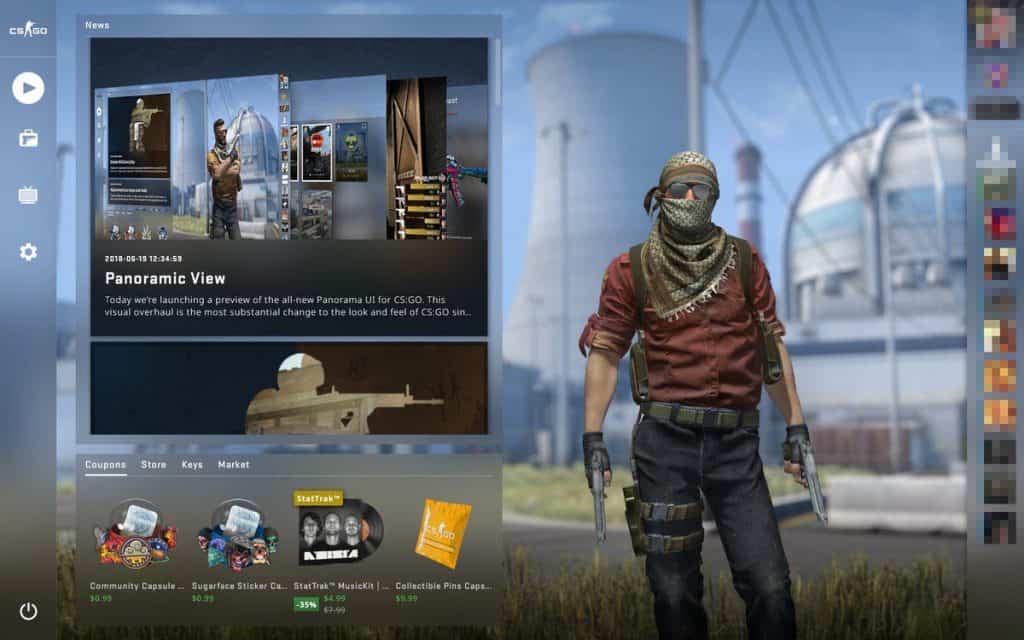
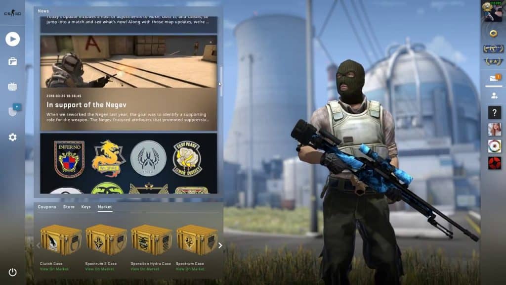
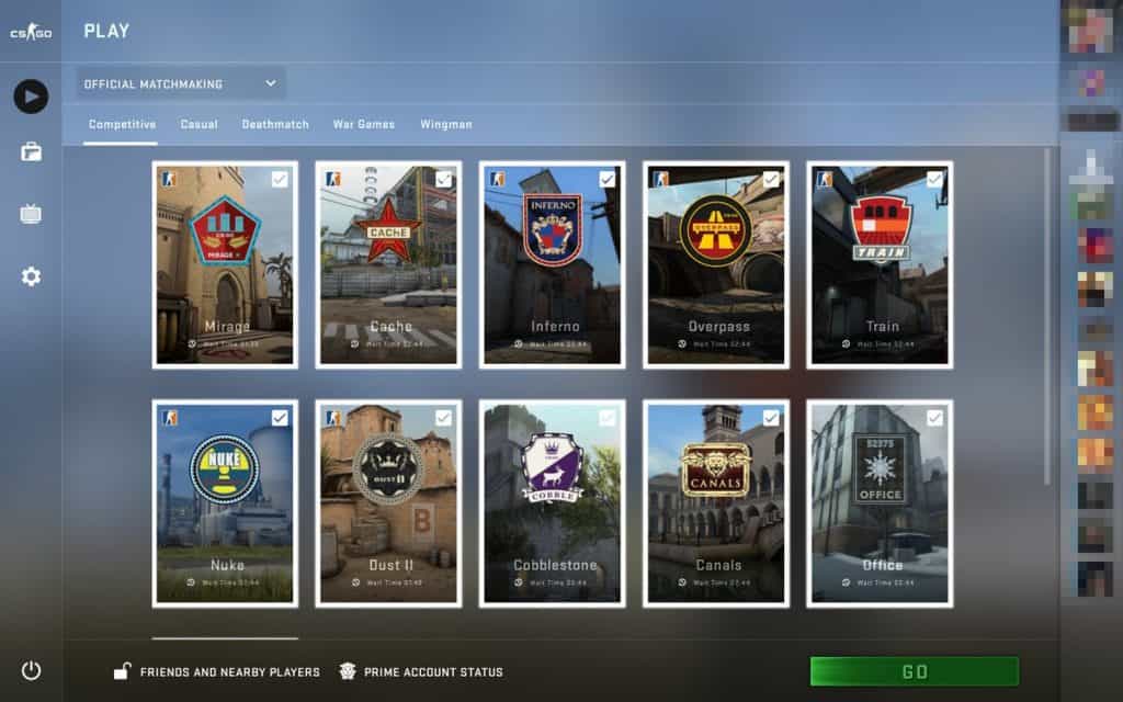
Valve got a major update this week that completely revamps the look and feel of the entire interface used in the game. Being such a big change, Valve described the overhauled interface as “the most substantial change to the look and feel of CS:GO since the game was released in 2012.” Additionally Valve stated : “From the Main Menu to the Scoreboard, the entire experience of interacting with the game has been updated”.
The game now looks entirely more modern and the Panorama interface presents a certain charm and usability that was previously lacking. Everything is excellently designed and bring the overall feel of the game and especially the menus up to a higher standard than previously attained. Everything from the main menu to the shops to the level selection feels and looks entirely new and clean. All of the icons have been redesigned to fit the new theme and they look just as good.
We are majorly impressed with the changes and new visual direction and presentation, it simply looks amazing.
